In late April Apple announced (along with other products) a new remote for its Apple TV set top box. I was so impressed with the redesign, and pleased with the fact that it was compatible with my older Apple TV, that I ordered the remote as soon as it came out.
That last sentence could just as truthfully been written as, "I was so tired of the inadequencies of the 3rd general Apple Remote…"
I’ve been using the 4th generation remote for about a month and a half now, and the short version of my review is: this is so much better than the previous remote!
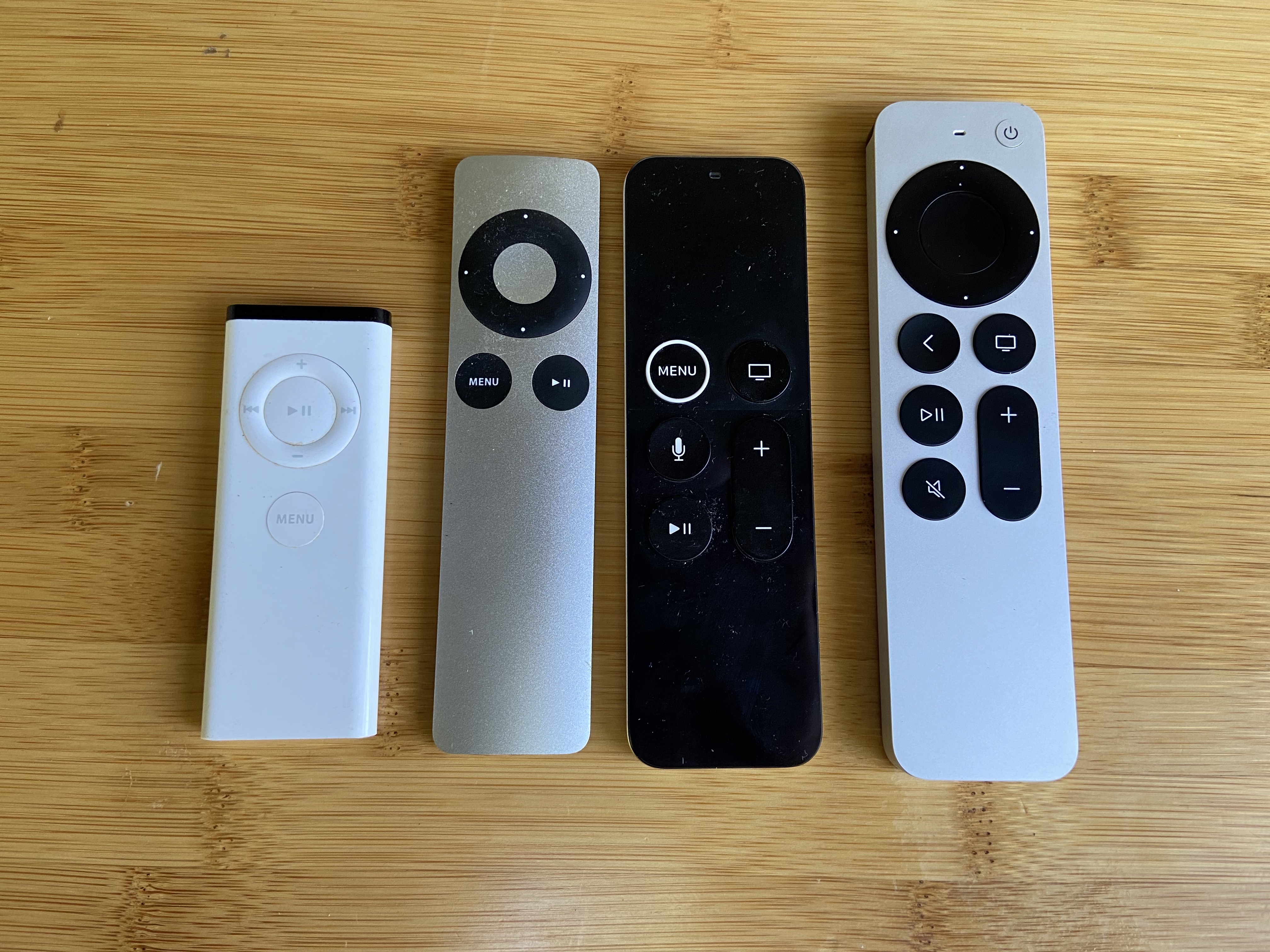
For some background, pictured above are all four generations of Apple Remote, and yes those are all mine. The first one (the white plastic one on the left in the picture) was introduced back in 2005 and looks an awful lot like the iPad Shuffle of that time. I did not own an Apple TV back when the first generation remote came out–no one did, because the first Apple TV was introduced until two years later. This original remote was meant to control media playback on an iMac and other Mac computers the at the time. When the first Apple TV came out, this remote also worked with it.
The second generation remote was released in 2009. The aluminum body of the remote resembles the iPod Nano of the same year. The most obvious functional difference is the Pause/Resume button was moved out of the click wheel, and the center button of the click wheel became a Select button that you could click or double-click like a mouse or touchpad.
The third generation was released in 2015 and doesn’t look like it belongs in the same product line at all. Take a moment to look at all four in the picture. Three of them have as the largest control a circle control with several functions, and some other buttons below. Not the third generation. The entire area about the buttons in a single touch surface. You can swipe with a finger or thumb and you can click. And while that gives you generally speaking most of the functions of the click wheel (moving the cursor of selection indicator on the screen of the device you are control up, down, left, or right and selecting things), it’s actually a not nearly as convenient.
I admit, watching the device being demoed on screen, I thought the touch surface as a brilliant choice. In practice at home, it wasn’t. With the previous remote, if you had a long list to scroll through on your screen, you could just hold down the part of the click wheel and the list would start moving on the screen. With the third generation you had to swipe, swipe, swipe, swipe, swipe, et cetera, et cetera, et cetera.
But the real annoying thing for both myself and my husband was that it is extremely easy to pick up the remote wrong. You can not tell be feel the difference between the touch surface above the buttons, and the non-touch surface below. You don’t know how many times one of us was swiping on the control and nothing was happening. And yes, it could be argued that if you just looked at the buttons you could tell which was the right direction, it just didn’t work out.
This latter might be about the way my husband and I both process information, but even glancing at it always took me a few seconds before I noticed that the word "Menu" was upside down when I was holding it wrong.
A few years after releasing the third generation remote, Apple released a very slightly modified version that added the raised right ring you can see on the menu button above which they thought would solve the problem. I didn’t get around to upgrading my old Apple TV to one that came with the third generation remote until after they introduced the white ring, and so I can say from experience that the white ring was not enough.
A lot of reviews I read of the third generation also complained about how easy it is, since half the surface of the remote is a touch pad, to accidentally click or swipe while you are watching something, can be annoying. I never experienced that because I only pick up the any remote when I want to change something, and I always immediately set it down again. Some people keep the remote in their hand the entire time they are watching something, and those or the folks I assume kept doing the accidental swipes and such.
The fourth generation brought back the circular control. The center bit of the control is a touch surface. You can swipe and click with it just like the larger touch surface of the third generation, but it’s a lot harder to do it inadvertently while you’re casually holding the device. The outer rim is a clever combination of touch surface and the four directional buttons of the second generation. You can click, or you can run your thumb around it to control movement of the onscreen cursor.
They added a Mute button, which is quite handy, and they replaces the Menu button’s name with a back arrow, which I think is a more intuitive representation of what the Menu button does. It doesn’t make a menu appear, it takes you back to whatever you were looking at before. They also added the little Power/Wake-up button, and they moved the Sire button off the main surface of the remote to the edge.
I should mention at this point that when Apple released the third generation remote, they renamed it Siri Remote. And I understand why they did that. The previous two generations didn’t have a microphone built in that you could use for voice controls. But it’s really just the next two generations of the Apple Remote.
The controls on the fourth generation are much easier to use. It is noticeably larger and feels much more solid in the hand. If I do happen to grab it with the end that ought to be pointing at the TV pointing back and myself, I can immediately tell because the round click wheel/touch surface feel nothing at all like the smooth aluminum of the wrong end. It is in every way a superior design.
I learned an interesting thing about myself while reading other people’s reviews of the remote. Many of those reviews mentioned that the placement of the Siri button on the right edge of the remote meant it was less convenient for lefties, since if you are holding the remote in your right hand, it is easy to press the Siri button with your thumb, but if holding it in your left hand it’s a slightly more awkward reach with the index finger.
I’m a left-handed remoter!
I always hold any TV-type remote in my left hand, and have never thought twice about it. Technically I’m ambidextrous, and my usually joke about that is, "Which means my handwriting is equally illegible no matter which hand I’m writing with." When I draw or paint I switch the drawing instrument from one hand to the other. Sometimes it’s because the angle is better in one hand or the other, but I’ve also learned over the years the sides of the brain that control each hand are better at different art tasks.
On the other hand, I was very strongly a left-footed soccer player back in the day, while much better as a right-handed basketball player than left.
Anyway, I had never noticed that I always use remotes left-handed before this. I even experiments after realizing, and it just feels completely wrong to put the remote in the right hand. It wants to transfer the remote to the other hand right away every time!
But, back to the review: it is a nice redesign. I’m really glad I upgraded. And I just have to say to the person I read online who claimed that it’s a "$79 remote that feels like a $39 remote" — have you actually bought any remotes that sell for ~40 bucks? Because I have, and they are cheap pieces of plastic that FEEL cheap and the have a tendency to peel and crack on the underside.
This solid aluminum remote feels nothing like that.